Choice Work

Yeah Write! logo is a bright, colorful and playful wordmark. 'yeah' is custom drawn, mono weighted, thin sans serif type. The forms mirror each other; the y and e flip to create the a and h. It is large and set in a bright green. 'write' is set in light blue, bold, humanist sans serif typeface and sits below the a and h of yeah. The last piece of the mark is the exclamation point; it is pink, mono weighted sans serif and elongated to span the height of yeah and write stacked.

Yeah Write!

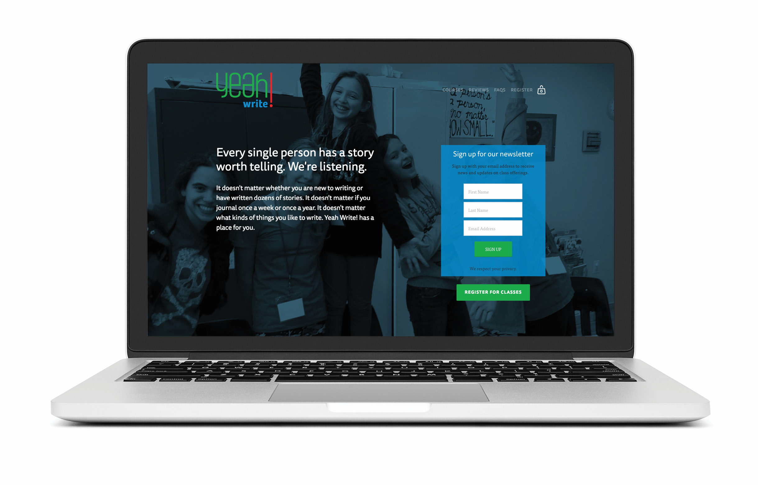
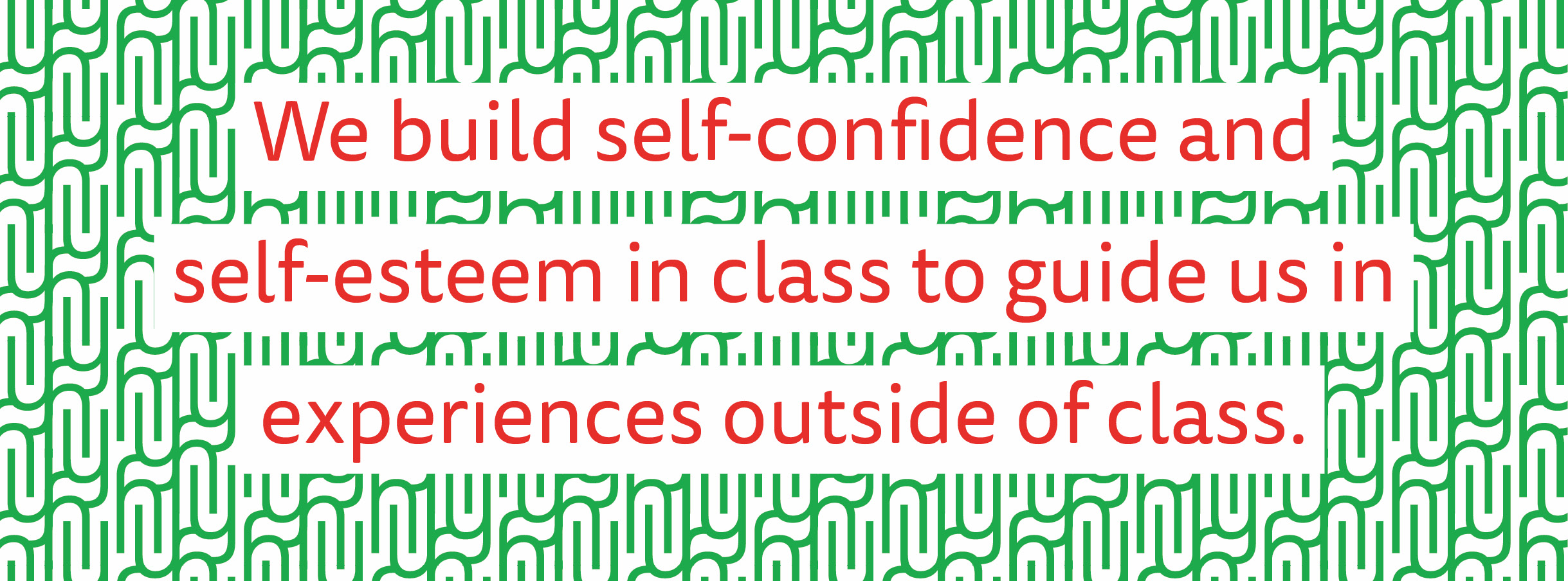
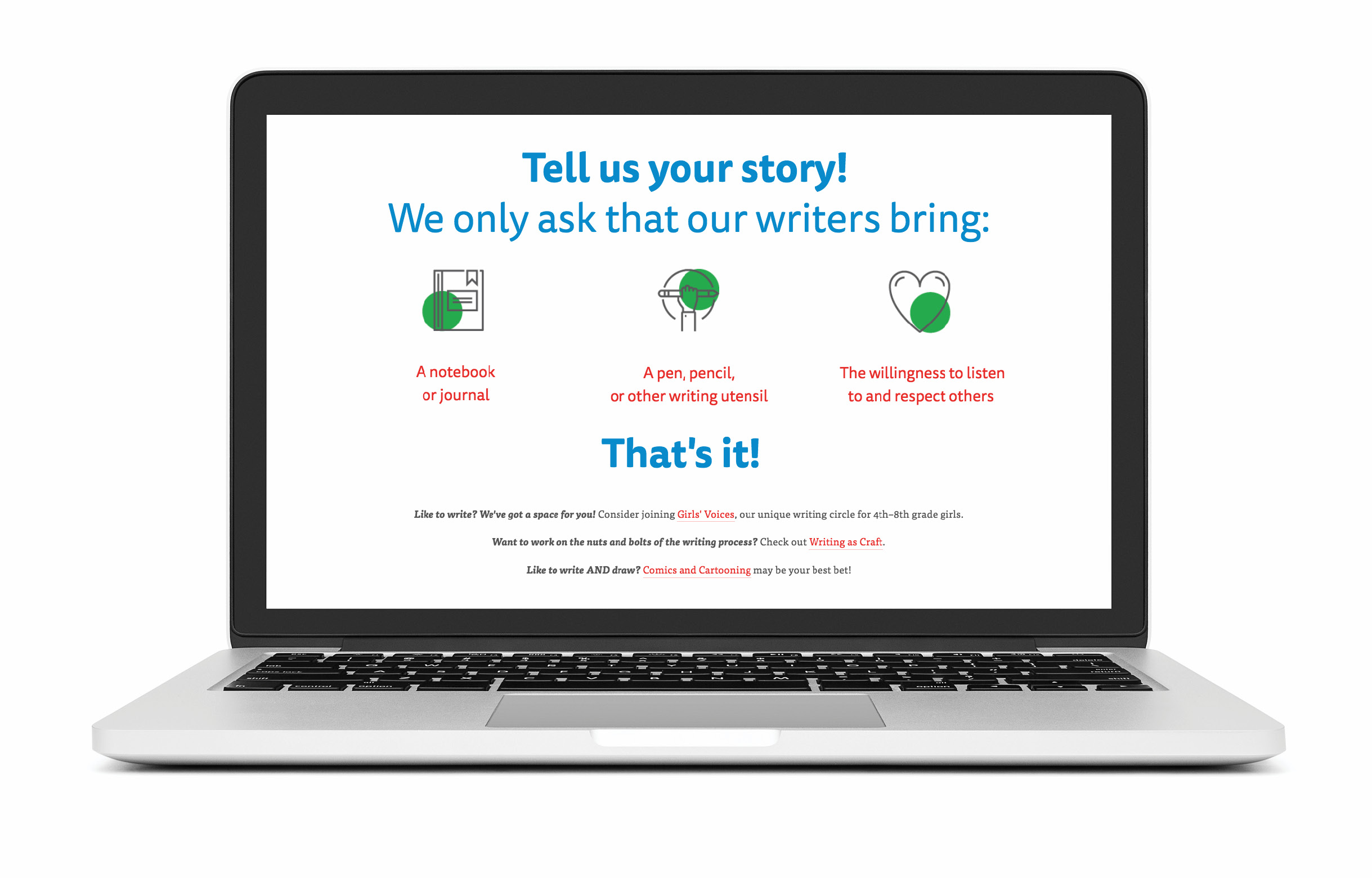
Design Choice rebranded this after school writing program. We not only updated the look and website, but renamed the program to better communicate the mission of creating space for youth to experiment with mindfulness, writing and fun.

  • Brand Design,  
  • Web Design,  
  • Creative Direction,  
  • Logo Design,  
  • Naming,  
  • Web Development  
A Mac laptop showing the Yeah Write! landing web page with a full screen image of a group of girls smiling and having fun. The homepage image has a dark blue overlay, and the Yeah Write! mission is on top of it in white san serif type. To the right of the mission statement is a newsletter sign up form.We build self-confidence and self-esteem in class  to guide us  in experiences outside of class.’ Value statement set in magenta a humanist san serif typeface, with a white background. The statement is on top of a green pattern created by Y and H from the logo.A Mac laptop showing the list of supplies one should bring to Yeah Write! Classes. Each item is accompanied by a line art icon: a notebook or journal; a pen, pencil or writing utensil; the willingness to listen to and respect others.We use a combination of mindfulness and creative writing to  find our  unique  writing voices.’ Value statement set in magenta a humanist san serif typeface, with a white background. The statement is on top of a blue pattern created by the w from the logo.

< prev home next >